2025
Brand identity
Stationery, packaging, social
Self-initiated
Mosaik
An art book publisher has the hardest job in branding: its own product is the most beautiful object in the room, and somebody else designed the cover. Mosaik stops fighting for the cover and takes every surface the books never reach.

The publisher nobody looks at
On a shelf of art books the publisher is a logotype eight millimetres high on a spine, and that is the correct size. The cover belongs to the artist. Anything larger and the imprint is competing with the thing it is trying to sell, a fight it deserves to lose.
The problem is that the shelf is no longer where the books are bought. Online, in a feed, on the side of a cardboard box, there is no spine, no bookshop and no cover by somebody else - there is only the publisher. Most imprints arrive in those places carrying the same eight-millimetre logotype and vanish completely.

A mark that is a container
The symbol is a circle and a square overlapping on a tilt, with the overlap knocked out to white. It is the shortest possible drawing of a mosaic: two pieces that fit, and a third shape made by the fitting. It survives at eight millimetres on a spine and at two metres on a banner without changing a line.
What makes it worth having is that it is a silhouette rather than a picture. Cut an image to that outline and any artwork becomes a Mosaik piece with no logo laid on top of it. The publisher owns the shape and the artist keeps the image, which is exactly the deal an imprint should be offering. On the book the mark stays small and quiet. Everywhere else the mark is the frame.

Every colour, therefore no colour
A list that runs from Bauhaus to street photography cannot have a brand colour. Pick one and the imprint has taken a side, and half its own catalogue starts to look like somebody else's. So Mosaik uses the whole spectrum: a gradient that belongs to no movement, no decade and no discipline.
It is restricted to edges. The trim of a card, a band across the packing tape, the border of a shipping label. It never runs under an image and never lands on a cover, so the books stay black on white and the colour only appears where there is no art to interrupt.

Broken like tiles
The name behaves the same way the symbol does. Set large enough, MOSAIK breaks across the edge of a cover and the letters land in pieces - some whole, some cut, one falling off the trim. Read it once and you cannot unsee the point.
It also solves a practical problem. A publisher's own merchandise is where identities usually go to die, because there is no artwork to hide behind. Here there is nothing to hide behind and nothing missing: black type, one red field, a spectrum sliver on the edge, and the name in tiles.

The box is the shop
A publisher that sells online gets exactly one physical moment with a reader, and it is a battered cardboard box on a doormat. Mosaik treats it as the shopfront: spectrum tape across the seam, the wordmark running up the side, a pink sticker on the corner, and a label that says thanks for your support - your next masterpiece is inside.
It costs a roll of tape and a sheet of labels, and it is the only retail environment the imprint controls end to end. The box turns up dented either way. The point is that it turns up as Mosaik.


Categories, not titles
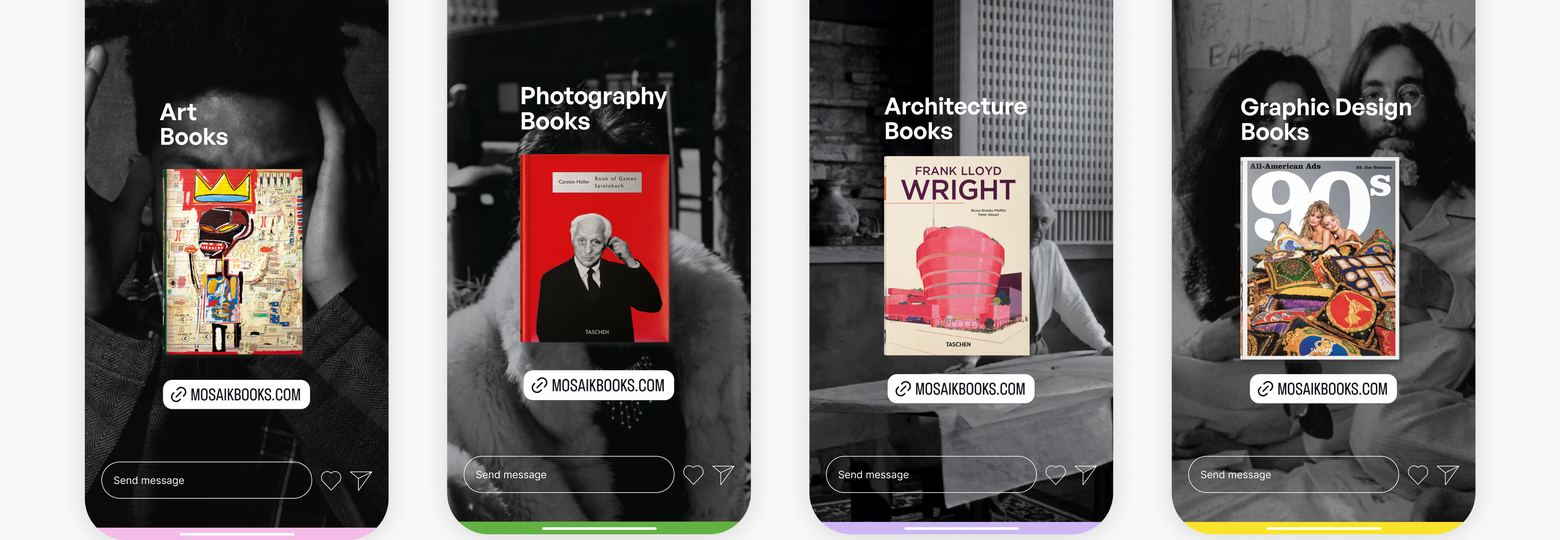
The feed follows the same rule as the cover. Mosaik does not post its own logo over a book; it posts the section you were already looking for - art, photography, architecture, graphic design - with one book held up inside it, and the address at the foot.
Four words carry a whole catalogue, and they never go out of date. A new season is a new photograph in the same frame, which is the only social system a publisher with no marketing department can actually keep posting.
What it comes down to
The books are the art. The brand is the grout: it holds the pieces together, it goes everywhere the pieces cannot, and you are not supposed to notice it until you go looking.
Design work