2024
Brand identity
Posters, packaging, social
Self-initiated
Cantina
Italian casual dining looks the same everywhere: a tricolour, a script logotype, a photograph of somebody's grandmother. Cantina drops all three and builds the brand out of a single word, set large enough to read from across the street.

A category that copies itself
Walk down any high street and the Italian places announce themselves in the same handwriting. Green, white and red. Warm wood. A close-up of cheese pulling apart. The signals are so widely shared that they have stopped signalling anything, and a new place is left with nothing to be recognised by.

The name is the poster
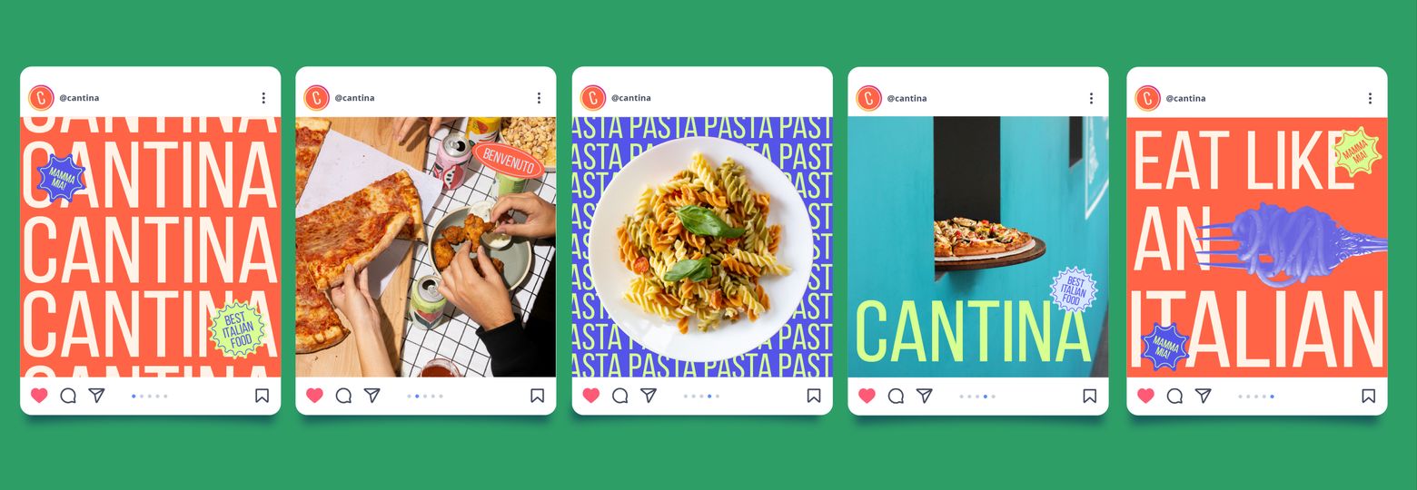
So the name does the work. CANTINA is not placed on the poster, it is the poster: a condensed grotesque scaled past the edge of the format and repeated until it becomes the background. You read it before you know you are reading.


Food that isn't trying to look delicious
Every photograph is flattened to a two-colour duotone: violet on lime, coral on baby blue, green on cream. The food turns graphic instead of appetising, which is the point. It survives being printed badly at A1, and it still reads at thumbnail size in a feed - the two places the category's glossy close-ups fall apart.
Six colours, four rules
One typeface. Six colours. One photographic treatment. Three stickers. The palette never mixes more than three of its colours in a single piece, which is what stops a system this loud from turning into noise.
- Warm cream#FFF3E7
- Neon lime#D8FF92
- Baby blue#D8E6FF
- Violet blue#5454E8
- Orange red#FF6446
- Lucky green#2E9E66
The stickers carry the voice
BENVENUTO, BEST ITALIAN FOOD, MAMMA MIA. They sit on the artwork like something applied after it was printed, which is what keeps typography this loud from turning corporate. They are also the only place the brand speaks Italian, so the accent stays a garnish rather than a costume.
The same system, three formats
A1 pasted on the street. A pizza box in one ink. A 1080×1350 feed. Nothing is redrawn between them; the rules simply run at a different size. The box is the cheapest of the three and does the most work, because it leaves the restaurant and lands on somebody else's table.


What it comes down to
The test of a system is whether somebody else can run it. Cantina's fits on one page: one typeface, six colours, one photographic treatment, three stickers. A manager can lay out next week's poster in an afternoon and it will still look like Cantina - which is the whole idea, because the studio should not be the bottleneck.
Design work